Randonautica 3: Initiation
Behold Randonautica 3, a complete overhaul of our app that will introduce many new features when we will release the final version this spring. If you would like to try out the new design already and get new features to play with, week by week until the official release, please stay tuned. We will publish an article about that here in the next days.
We came a long way from the previous version, even though it might not be so obvious when you first open it. The overhaul has been literally done from scratch and encompassed the app codebase as well as crucial parts of the design.
One Source to Rule Them All
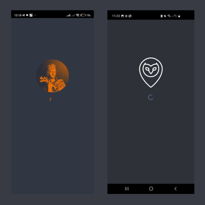
After the collapse of the first chatbot in late 2020 we managed to come up with a new, fully functional, stable, and scalable application after just three weeks of development - the one you have been using for the last years. This had only been possible because our head developers Taha and Ziad had offered to adapt the Java codebase of an Android app called Forecast Fortuna which they had released before, providing a barebone framework to host most of the Randonautica functionality. To offer Randonautica also to our iPhone users we additionally hired an iOS developer to copy the same look and feel for an iOS app.
Here are screenshots of Forecast Fortuna next to the current Randonautica App showcasing the inherited elements:
While this solution allowed us to quickly come back onto our feet, the long-term disadvantage was having to develop, maintain, and debug two parallel codebases for both mobile platforms. This approach wasted time and money and we were stuck with the iOS app always lagging behind Android in terms of new features.
So in late 2022 we decided to completely stop development of new features and try a radical new approach: let's spend all of 2023 to remake the app from scratch with a development framework called Flutter that is suitable to compile for both platforms at the same time!
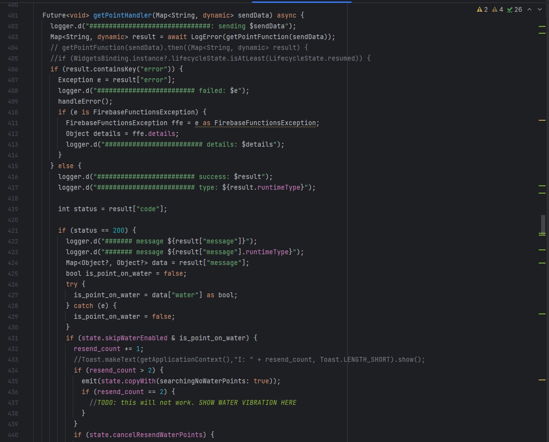
Flutter's native programming language Dart looks like this:
Now that we are well into 2024 we finally did it! We are excited to release Randonautica 3 soon, the first instalment of the app developed entirely in one codebase, without time pressure and without platform constraints.
Back to the Drawing Board
Our PM Tobias and our UX designer Kerry also took the opportunity to re-evaluate and overhaul the complete user interface design which started to feel a bit stale after all the years.
The previous design wasted quite a bit of precious real estate. We focused on getting rid of all the unused screen space, margins, paddings, unnecessary headers, and floating buttons to provide more space to the actual content of the app: navigating maps and browsing Discover reports.
Most importantly we took a step back to have a better look at the big picture and we asked ourselves important questions about usability and user experience.
Jailbreaking the Hamburger Menu
First of all: Hamburger Side Menus! Feels so 2017, right? An uninspiring list of entries that all look similar. It served its purpose but we wanted to kill it! When we introduced the Discover feed in 2022 we noticed that users took a long time to realize it even existed. Why? Because it was hidden away in the hamburger menu! That's when we added the circular buttons at the top right of the screen to enable quickly switching between the Point Generation and Discover activities. While it did a better job inviting new users to Discover - it always felt shoehorned and out of place. This felt like a dead end: lack of space for new features navigation.
The new app solves a lot of these issues by introducing an intuitively to use navigation bar at the bottom of the app from which all of the main activities of Randonautica are easily found with a single tap: Point Generation, Discover, Bookmarks, and the Shop.
Everything else, like News, Help, and Settings now lives in a new Menu Page quickly accessible via the Navigation Bar. We avoided making it look like a boring list and came up with the look and feel of a bulletin board that allows you to find the latest news and other features at a glance.
A Drawer Full of Ideas
While working on the redesign we tried to keep the more intuitive elements of the app and hide the parts that tend to overwhelm and confuse some new users.
One good example is the bottom panel of the main activity in the app that lets randonauts generate new points. Some new users tend to get overwhelmed by the sheer amount of different options. The new app has a radically reduced bottom panel with a large circular button together with just the essential info right next to it. It is inviting the user to just intuitively press it to start their random adventure.
The settings that more advanced randonauts like to have available at every step of the point generation process are conveniently accessible in a sliding drawer above the button that can be swiped open any time if needed.
This drawer also allows us to easily host all kinds of new features there, giving us much more freedom to develop random tools without having to squeeze buttons and info panels into the already limited user interface. There will be quite a few tools and new features coming up that had been stashed away because we simply didn't have space for them in the old app.
More Soon
Stay tuned for more articles about how to become a beta tester and showcases of the new features as they are being developed.
(title photo by Emmanuel Keller)